
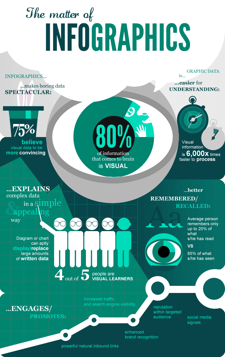
Infographics are used to bring about data and information concerning a specific topic and making it into a visual representation. According to Quintagroup.com, "Infographics are a graphic visual depiction of information, facts, or knowledge that helps people comprehend a topic better. It mixes data and images to create visual illustrations that are straightforward, easy to comprehend, and entertaining for viewers."
The following three infographic sites are used to create infographics:
1. Easelly:
Students connect with knowledge in new ways by producing infographics and acquiring more experience with technology using Easelly, which may be an entertaining and effective learning tool. The range of tools and examples on this site entices users and encourages them to be creative. Because Easelly is so open-ended, it can be utilized for anything; all it takes is careful planning. Students feel empowered when they complete an infographic because it gives them greater control over their learning, and the site's emphasis on visuals makes it accessible to students who struggle with written language.
The site's overall versatility is both its greatest strength and its greatest weakness. Students can have meaningful experiences with the content they create, but teachers must provide sufficient supervision so that students do not become lost.

3. Infogram:
It's quite simple to use the site; it mainly just recycling and updating pre-existing templates. The end result, however, can be a stunning visual that's ready for a presentation — or a report — and can help students better understand and interpret scientific studies, historical timelines, and other data. While creating an infographic might be an enjoyable experience, it is unlikely that students will want to do it every day. The site also lacks a lot of extra materials; more design lessons and exercises will make it a better learning tool. However, it's simple, enjoyable, and a terrific approach for pupils to begin visual thinking.
The biggest problem with the site is that it is devoid of content; teachers will be unable to access resources.
The site's biggest flaw is its lack of text; teachers will be unable to discover information to assist them in using the tool, and students will be unable to learn about design best practices. Teachers will need to take an active role in offering feedback to students, as well as assisting them in effectively presenting information and understanding how their creation depicts and explains the data they're working with.
The infographic site I gravitated to most was, Piktochart. It reminds me of Canva, a well-known website that allows one to create a design for flyers, posters, infographics, invitations, etc. With the similarity between the two, it made it easier to approach Piktochart for my infographic.
My infographic is inspired by an article on PEW Research Center over facts about Americans and Instagram by KATHERINE SCHAEFFER.

https://drive.google.com/file/d/1Frx5tM7cO2A28pcV8kpb2kB6ZcZRHZXI/view?usp=sharing
Click here to view my infographic online!
Teaching with Infographics
Teaching with Infographics can be a great way to get students to analyze information. They are able design a visual representation of data, bringing to life a dynamic way of internalizing information and then producing these detailed visuals that represent the student's thinking process.
Please watch this informative YouTube video, this can be shared with teachers and librarians!
5 Infographic Activities for Students (w/Templates)
5 ways to use infographics in the virtual or physical classroom:
Activity 1: Teach students how to analyze and interpret infographics.
Activity 2: Encourage students to compare two objects, ideas, or places.
Activity 3: Ask students to visualize data and information.
Activity 4: Use infographics as part of a scenario-based learning approach.
Activity 5: Encourage students to tackle a complicated procedure or technical information with process infographics.
Sources:
https://quintagroup.com/services/infographics
https://www.youtube.com/watch?v=CGFjy-Hqr7U
https://www.commonsense.org/education/website/piktochart
https://www.commonsense.org/education/website/infogram
https://www.commonsense.org/education/website/easelly
https://www.pewresearch.org/topic/internet-technology/
https://www.pewresearch.org/fact-tank/2021/10/07/7-facts-about-americans-and-instagram/
https://www.frontporchsolutions.com/benefits-to-using-infographics-in-content-marketing/
https://www.pewresearch.org/journalism/2021/09/20/news-consumption-across-social-media-in-2021/


No comments:
Post a Comment